
When I first discovered I could “see” what I was hearing using OmniMic’s acoustic measurements, it was fascinating. Frequency response, decay time, and reflection plots offered real insight—but over time it became clear that each chart stood alone, with no clear way to connect them or decide what to fix first. Each plot felt like an island of information, with no bridges between them.
This article is not an argument for replacing listening with measurements, nor for chasing perfection. It is an attempt to make measurements more useful—to help listeners decide when action is warranted, what deserves priority, and when it is reasonable to stop trying to fix things and simply enjoy the music.
Charting Shortfalls
Modern room-measurement tools such as Room EQ Wizard and OmniMic provide powerful data, but in my opinion fall short in several areas:
- Visual overload: Frequency response graphs can look very different depending on how much smoothing is used, and waterfall and Energy Time Curve plots for early reflections can be cluttered and hard to read. It’s often unclear as to which chart and settings matter most.
- Missing perceptual context and stopping rules: Charts show every little deviation, but they rarely tell you which ones you can actually hear. Without clear guidelines or limits, listeners are left guessing what is “good enough.”
- Hidden symmetry problems: Stable imaging depends on left/right symmetry across early reflections, decay times, and frequency balance. Rooms that aren’t symmetrical, or that use different materials on each side, often disrupt this balance, yet symmetry issues are rarely pointed out or emphasized.
- No clear path from measurement to action: Even when charts offer clues, they rarely make it clear what should be fixed first or where in the room the problem is most likely coming from.
Acknowledgment of Sources
The concepts, tables, and figures in this article are informed by established research in psychoacoustics and room acoustics, drawing on the work of experts such as Floyd E. Toole, Leo Beranek, and Everest & Pohlmann, as well as widely used listening standards from the ITU-R. The way these ideas are organized and weighted here is my own approach, designed to connect academic research with real-world decisions about setting up and improving a listening room.
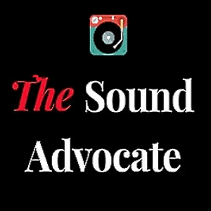
An emergency-room triage analogy helps explain this approach. In an ER, doctors don’t try to fix every vital sign just because it’s not perfect. They look at what’s within a normal range, consider how serious each issue is, and focus first on what’s most likely to affect the patient. Room measurements work the same way. A deep but very narrow dip in the high frequencies may look alarming on a graph but usually doesn’t matter much because it’s hard to hear. Meanwhile, a small left-right mismatch in early midrange reflections might look minor on paper yet can seriously blur the stereo image.
Towards a Practical Solution
Listening tests are always a sensible place to start before firing up the measurement software. Table 1 below shows how common listening impressions usually line up with specific types of measurement issues.
| Region | Frequency Response | Decay Time | Early Reflections |
| Bass | Bass weight may sound boomy or thin | Bass may sound slow, lingering, or one-note | Bass image may pull to one side or feel unstable |
| Low mids / warmth | Warmth or body may sound chesty or hollow | Low mids may appear muddy or rhythmically sluggish | Warmth may feel spatially uneven left-to-right |
| Midrange | Vocals and instruments may sound forward or recessed | Detail and articulation may feel blurred | Center and vocal focus may feel soft or unstable |
| Presence / upper mids | Presence may sound shouty or dull | Transients may sound fatiguing or smeared | Stage edge precision may suffer |
| Air / top end | Air and sparkle may sound excessive or muted | Highs may sound splashy or overly dry | Stage width and air cues may feel inconsistent |
Table 1. Common subjective impressions linked to frequency response, decay time, and early reflections.
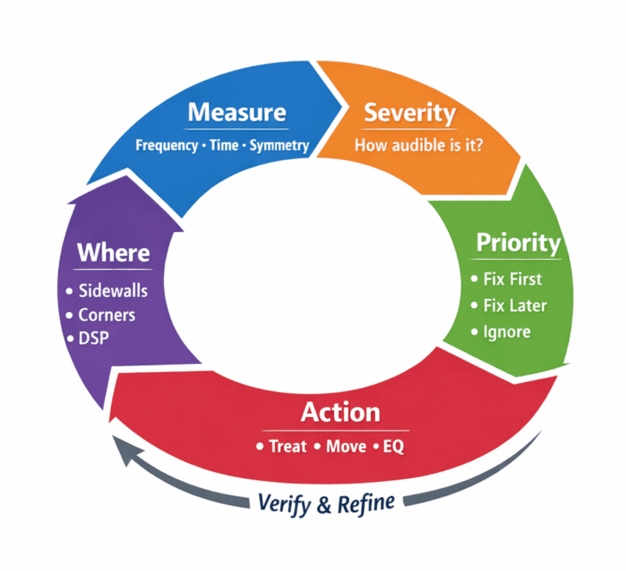
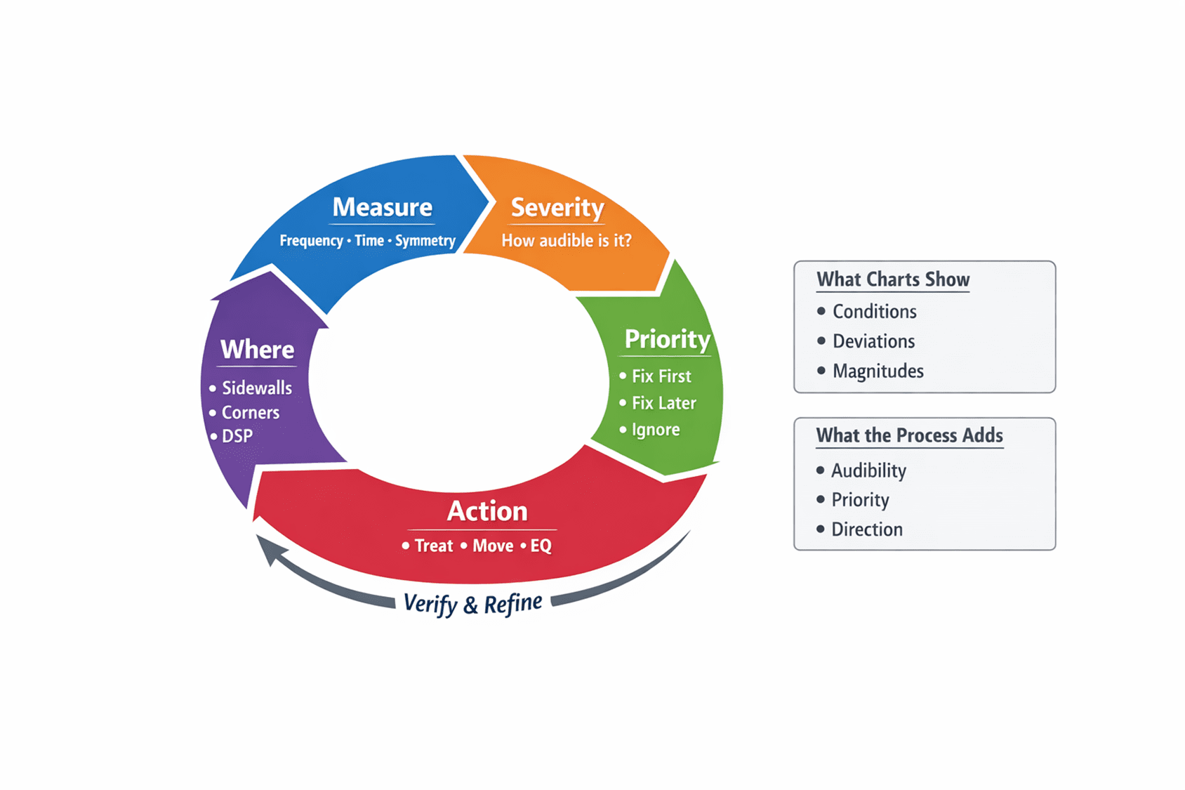
| How the Triage Process Works (Quick Overview) 1. What You Can Hear Measured differences (like left vs. right or compared to a target) are first looked at based on how likely you are to actually hear them — considering things like frequency, timing, size, and balance. This isn’t an exact yes-or-no, but more about what usually matters and what usually doesn’t. 2. Severity The differences you can hear are then ranked by how much they tend to affect what you listen to. 3. Normalize Since early reflections, decay times, and frequency responses are all measured differently, the seriousness of each issue is adjusted to a common scale so they can be compared fairly. 4. What Comes First The biggest, most noticeable problems get top priority, no matter which type of measurement they come from. 5. What to Do Next Common patterns of serious issues are linked to parts of the room or fixes that are most likely to help first. |
The triage process can be summarized in Illustration 1.
What’s been missing is a simple way to rank problems by how serious they are across different frequency ranges. When your left and right speakers don’t match each other, or don’t match a target curve, a severity score helps answer two key questions: Will you hear this? And if so, how much will it affect what you hear?
Listening impressions aren’t separate from measurements—they’re closely connected. If differences between the left and right channels, or between the speakers and a target curve, can be expressed as numbers, then the next step is judging how important those differences are. That’s where perceptual weighting comes in. Our ears are more sensitive to some frequencies and timing differences than others. For example, a small 2 dB mismatch at 2 kHz can be obvious right away, while a much larger difference at 40 Hz may barely register. Perceptual weighting accounts for this by giving more importance to problems in ranges where our hearing is most sensitive, and less where it’s more forgiving. This idea applies equally to early reflections, decay times, and frequency response.
To meaningfully compare different units of measure across the pillars, their deviations first have to be put on the same scale, or normalized—much like converting different currencies into one before comparing values. Once normalized, a deviation at 500Hz in the frequency response, an early reflection asymmetry at 7ms, and an overlong bass decay are now comparable: not by how large they look on a chart, but by how likely they are to be heard. Maximum severity is used to identify the dominant contributor, which typically governs what is heard first.
In practice, this doesn’t mean directly comparing decibels to milliseconds. Instead, each measured issue is first translated into a limited “severity” score based on how likely it is to be heard—taking into account things like frequency range, timing, bandwidth, and left-right balance. These scores are then mapped onto a common scale, so different kinds of problems can be compared by how much they’re likely to affect what you hear, not by how dramatic they look on a chart. The goal isn’t mathematical perfection, but a consistent way to decide what matters most.
In the following examples, “typically audible” and “rarely audible” simply mean differences that usually fall above—or stay below—what people can hear in terms of loudness, timing, and bandwidth under normal listening conditions.
Figures 1–4 illustrate a recurring problem: charts can both overstate and understate what we hear.
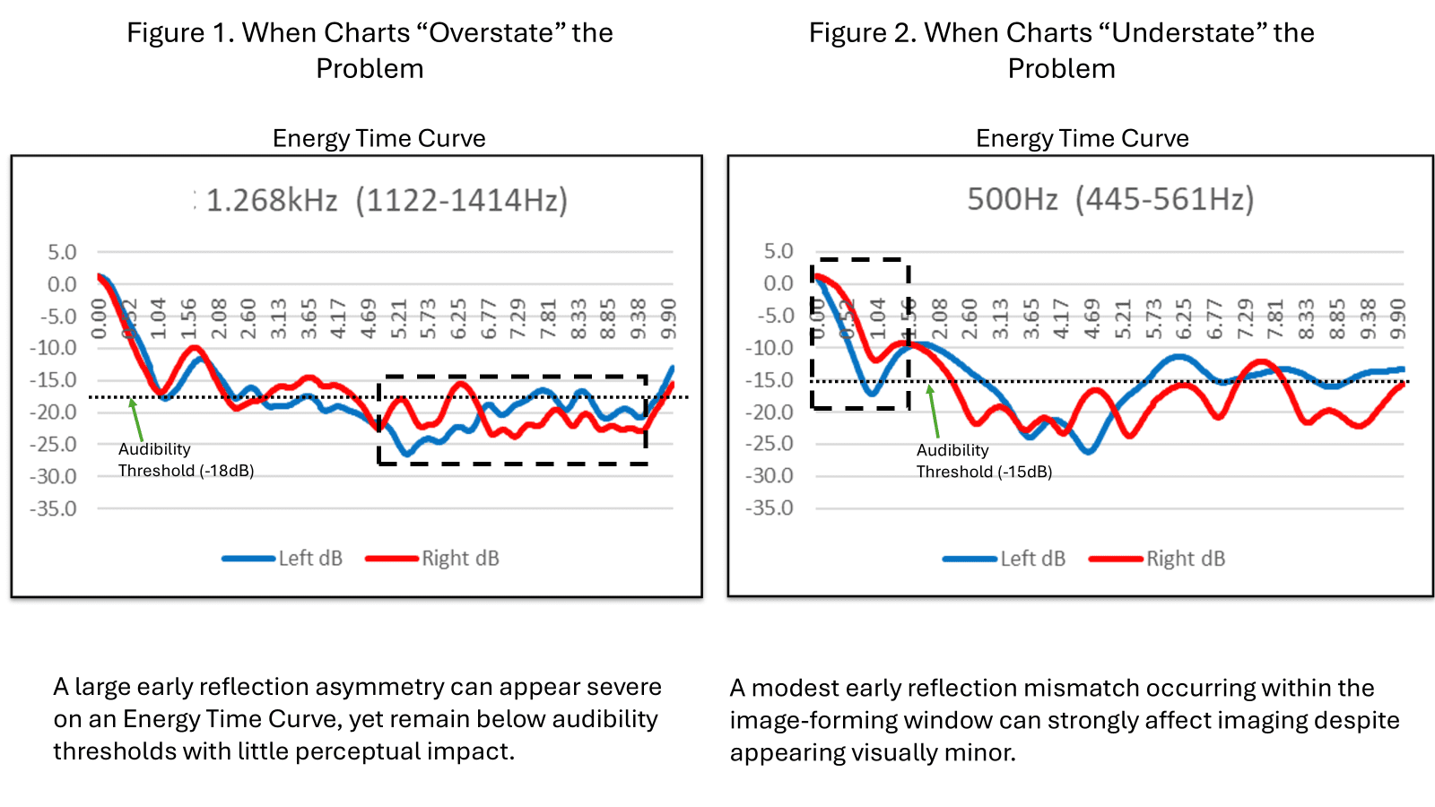
Figure 2. A small-looking early-reflection imbalance that’s usually easy to hear because of when it arrives and which frequencies it affects.
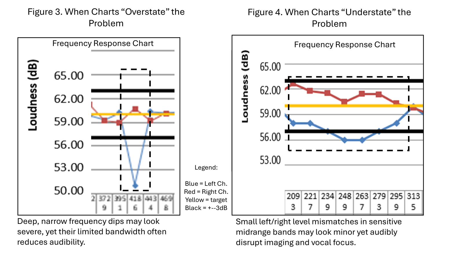
Figure 4. Subtle-looking asymmetry that strongly affects perceived balance and clarity.
These examples show why visual prominence alone is unreliable. What looks severe may not matter, while smaller-looking asymmetries may dominate perception.
Table 2. Recurring cases where chart severity diverges from perceptual audibility.
| Pillar | Example | Looks Severe on Charts | Typically Audible? | Why Charts Can Mislead |
| Early Reflections | Early left/right timing mismatch in the midrange (≈1–4kHz, <7ms) | No | Often | Image-forming time window and high perceptual sensitivity make modest asymmetries highly audible |
| Frequency Response | 2–3dB left/right imbalance at upper midrange (2–3kHz) | No | Often | Localization is highly sensitive to small inter-channel level differences in this range |
| Early Reflections | Late or low-level left/right asymmetry (>15ms) | Yes | Rarely | Occurs outside the image-dominant window and is often masked by direct sound |
| Frequency Response | Narrow-band high-frequency left/right asymmetry | Yes | Rarely | Narrow bandwidth and limited musical content reduce perceptual significance |
| Frequency Response | Deep, narrow high-frequency null/dip | Yes | Rarely | Large visual deviation but limited bandwidth and low perceptual weighting |
| Frequency Response | Sharp comb filtering outside sensitive bands | Yes | Rarely | Visually dramatic but often masked and perceptually small |
| Decay Time | Short high-frequency decay (room sounds “dead”) | No | Often | Reduced late energy diminishes envelopment and perceived liveliness |
| Decay Time | Upper-mid decay mismatch between channels | No | Often | Subtle decay asymmetry disrupts spatial balance and clarity |
Table 2. When measurement charts mislead — and when they don’t.
From Measurement to Action
By combining severity scores within and across the three pillars, charts stop being just descriptive and become a tool for deciding what to tackle first. This makes it much easier to see which issues are most likely to be heard—and therefore which ones deserve attention first.
It helps to avoid chasing problems that look dramatic on a graph but can’t really be heard, while making sure subtle but important issues don’t get overlooked.
Just as importantly, patterns in severity often point to likely physical causes:
- Early reflection problems usually point to the sidewalls, front wall, or back wall where the first reflections occur.
- Decay-time issues, especially in the bass and low midrange, often trace back to corners, floor-to-wall junctions, and rear walls.
- Frequency-response issues often suggest adjusting speaker placement or the listening position, and then using DSP or EQ after physical treatments have been addressed.
In this way, measurements stop being isolated charts and start working more like a map: severity shows what matters most, and priority points to where to look. The result is a clearer path from diagnosis to action, and fewer blind adjustments along the way.
Note: Because rooms vary widely in size, geometry, and construction, these cues indicate where to look first. They do not guarantee a fix that works in every room.
Measurements remain indispensable—but only when listening impressions, severity, and likely room causes are considered together do they become reliable tools for deciding what to change, what to ignore, and when to stop tweaking.


Leave a Reply